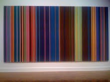
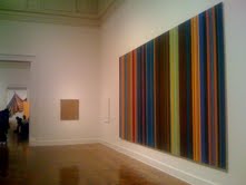
The Quest for the Best Chest

While looking for some “feminine” rustic chest options for one of my clients I came across a few nice pieces at the Highpoint furniture market last week. There is a reason why chests sometimes are qualified as accent pieces. Some of them have strong enough character to stand out on their own and create a bold accent in a room. But in today’s market that tries to please everybody it is hard to find a chest that would not have too many things going on at once. Here are some pieces that caught my eye for their clean and honest look:

A Messina chest from Noir could have been my favorite piece with its gentle curves and unusual zinc finish. I kind of liked its exaggerated width even though it made its drawers hard to open. As I said it would be my pick if the construction quality was not so poor. And here is another nice piece:

I was attracted to that plain and simple chest for the very same qualities. Seams like it could go with almost everything still maintaining its own unique style. I could not open its drawers though. It is too bad because I would not want to destroy its nice clean lines with any pulls. This chest on the other hand is screaming for some new pulls:

A set of plain and larger pulls or just some simple round metal or glass pulls would make that piece a winner. I love its weathered wood finish and gentle feminine curves.

Finally, I can’t stop thinking of the Restoration Hardware Directoire chest. There is something very graceful and timeless about that piece. It has such an honest look and perfect proportions. That’s my pick:


The Bay of Color

Art in the window display of the Susan Calloway Gallery in Georgetown always makes me hit my brakes!

When driving down to M Street last night I saw an ocean or more precisely a bay of color: two stunning paintings by Stephen Day representing the colors of the Chesapeake Bay. It is so realistic yet abstract! – one would say about Day’s representations of color, mood and seasons of the Chesapeake area. And it is such a new and refreshing way of portraying the Bay. Interestingly… the show reminds me of the recent presentation of the Washington Color School at the Corcoran Gallery of Art – especially the paintings by Gene Davis. See my post below.


Colors of Washington DC

For those who love color and the city of Washington there is a rare treat – a show at the Corcoran Gallery of Art featuring artists associated with the Washington Color School. Among them Gene Davis and Thomas Downing who were both based in Washington, DC.

Washington Post art critic Paul Richard who spoke last week at the Corcoran said he could see some pastel yet vibrant colors of the cherry blossom festival in the paintings of Gene Davis and others from the Washington Colors School. He said their art was so unique to the DC area and so different from the paintings of their NY contemporaries from the abstract expressionist movement.

Well, I just loved to stare at those large scale paintings at the Corcoran. Some of them take up almost the entire wall of the exhibition hall. I could see that the individual colors were really defined by their interaction with the others.


A Well Read Table

Here is a creative approach to sustainability. Belgian artist Jens Praet builds limited editions of furniture from shredded magazine and newspaper pages. Praet mixes strips and pieces of paper with resin and let the pulp sit in a mold of his design until it hardens. With bigger pieces like his 6-foot table Praet uses a metal skeleton for stability. The recycled material gives his furniture a unique texture and color. Check out Praet’s work at the Industry Gallery in NE Washington DC. http://industrygallerydc.com/Site/Current.html

Images © Ivo van den Baar and Violetta Markelou


Welcome!

The new year comes with many reasons to celebrate for us.
Eisemann Design has a brand new website at www.eisemanndesign.com
Please come and check our latest interior design projects pictured by some brilliant photographers from www.panoramastreet.com.

We also introduced a new service: a special one hour interior design consultation covering basic redesign ideas and color scheme suggestions.
Feel free to contact iza@eisemanndesign.com for details.

This blog is also a new thing for me. I look forward to sharing with you my design thoughts and interesting items from the art and design world.

Thanks for reading!

Iza


Privacy Settings
We use cookies to enhance your experience while using our website. If you are using our Services via a browser you can restrict, block or remove cookies through your web browser settings. We also use content and scripts from third parties that may use tracking technologies. You can selectively provide your consent below to allow such third party embeds. For complete information about the cookies we use, data we collect and how we process them, please check our Privacy Policy
Youtube
Consent to display content from Youtube
Vimeo
Consent to display content from Vimeo
Google Maps
Consent to display content from Google