How one attic became usable

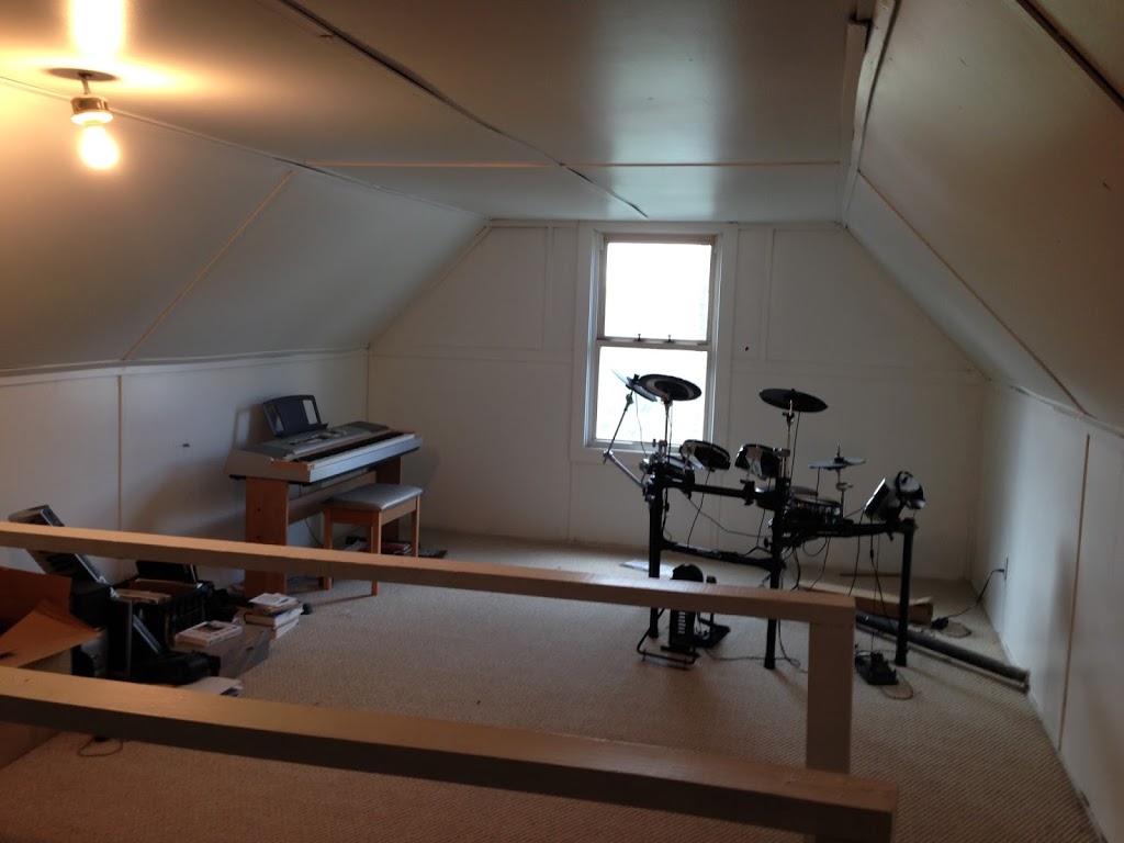
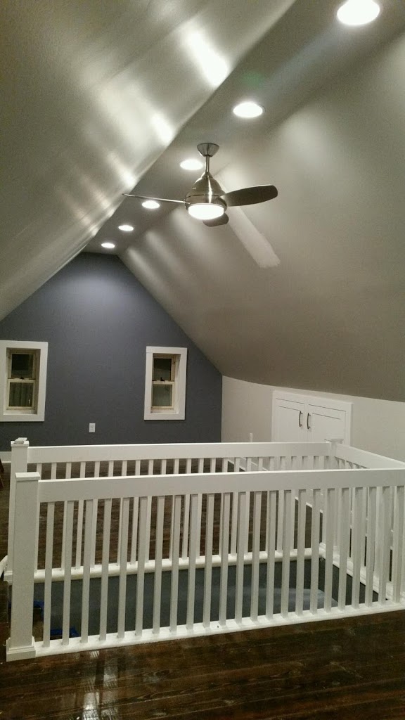
One of the projects I have been working on lately is an attic home office. My clients decided to renovate a decent size half-finished attic to use it as a shared office for her and him as well as a music lounge area. The photo below shows the attic before the renovation with a low ceiling and poor lighting. There was no insulation which made it impossible to use the area all year long. 

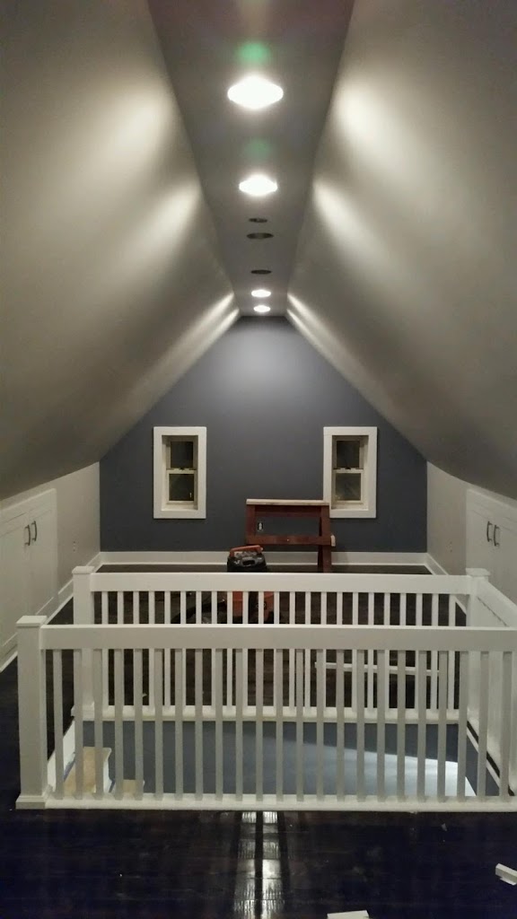
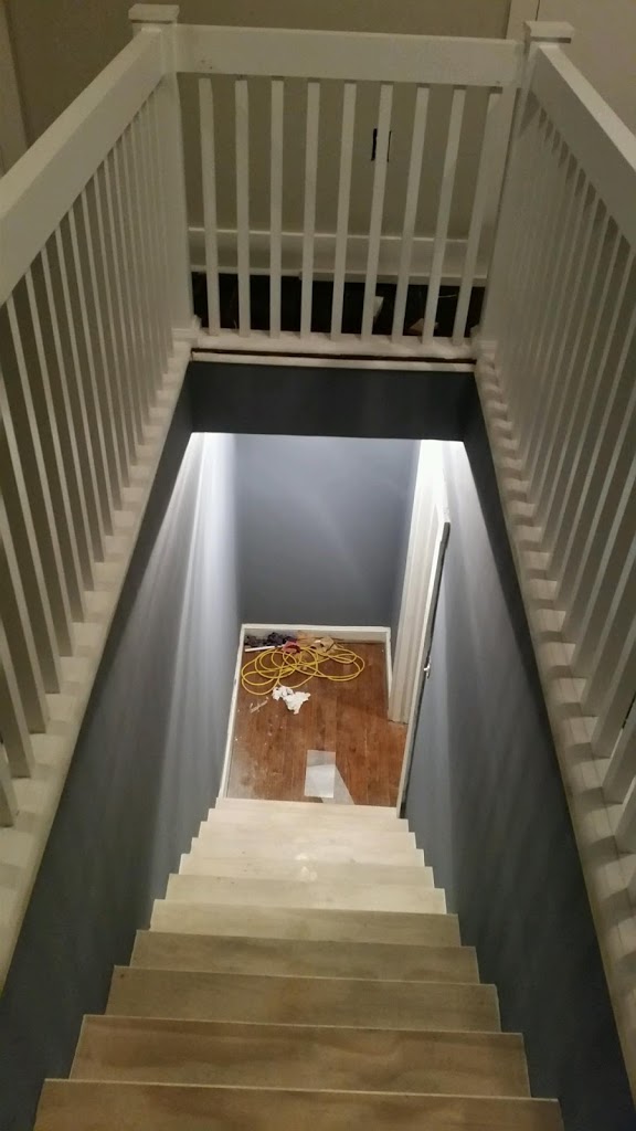
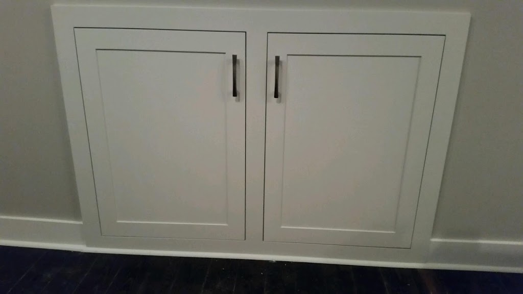
The attic has been completely gutted and insulated. Ceiling was elevated and covered with new drywall. Old carpeting was removed and existing hardwood floors refinished using a sophisticated dark stain. New energy efficient recessed lighting was installed along the ceiling together with a ceiling fan over the staircase. The staircase itself received a facelift to match the railings in the house and to meet safety requirements. Below are some photos of work in progress:


Free space behind the knee walls was used to build spacious storage units with stylish cabinet doors. All doors, trims and window casements were painted white. Walls and ceiling painted in light gray while both gable walls were treated as accent walls and painted in a darker shade of blue/gray.


Construction phase of the project is finished. Now on to the furnishing and accessorizing. We will be using mostly office furniture from IKEA, which is a great deal for the quality you get. I will keep you posted.

A conference room dedicated to women

Finally, I have some photos of my latest commercial project to share with you! I had the pleasure to work with the American Pharmacists Association in Washington DC on the Women in Pharmacy Conference Room. It is a special place at the APhA’s beautiful headquarters in downtown DC dedicated to the women who significantly contributed to the profession of pharmacy in the USA.

Floral motive on the glass partition and the family tree is inspired by the cherry blossoms native to the Washington mall located just outside of the APhA headquarters by the Lincoln Memorial.

I tried to be sensitive to the contemporary design of the building and its green principles – I selected materials that are environmentally friendly and mostly made in America.


Nando’s flavorful decor

How often do we realize that a restaurant we go to for lunch actually has a nice decor?
Do we even see what surrounds our lunch table any more? I think that in today’s fast paced world we tend to just take an hour long break and rush to a lunch place to grab some quick food. We mostly end up having an ok lunch for almost exactly the same price – around $10 per person in the Washington DC area. If the price for a lunch is artificially maintained at the same level no matter the cuisine, why would anybody care to put some extra attention into decor to make a restaurant any different or nicer than the others? So, all the lunch places in the area look more or less the same, lacking personality.

I think it takes away so much from our dining experience. Pushing out local business and growing domination of chain restaurants is part of the reason. That’s why it is important to point out chain restaurants that actually stand out against the crowd and put some extra effort to create a nice ambiance for dining. Nando’s Peri Peri is one of those places.

 I have been to the Washington, DC and Silver Spring locations of this international chain. They carry a common African theme presented in contemporary manner yet the decor details are slightly different. The furniture layout is always unique to each place with booths and nice oversize tables that can accommodate larger groups. There are different clay pots with exotic wood limbs. Sculptural pendants create accents and set the mood. Colorful paintings on the walls are original!

I love how the unique flavors of this South African cuisine were translated into the color schemes. Warm shades of reds and oranges used in paint, chairs color or artwork represent a signature spice – Peri Peri (red pepper in Swahili). Bold wall finishes with reach texture (photo below) make me think of an African desert.  The food is very tasty, but an interesting and unique decor makes it easy to pass on many other restaurant options in the area and return to Nando’s.


Farmer’s Market Inspiration

My best design ideas are usually inspired by nature. Today I came back from my local farmer’s market in Silver Spring with delicious fruits and veggies… and also with some fresh paint color ideas.

The paint colors below come from the Infinite Beauty Collection by Mythic – a low VOC, non toxic paint.
 

Kitchen in Italian Sun. Accent wall in Raspberry Ice.

Living Room in Taupe Temptation. Accent wall/accents in Buttered Toast and Spanish Rose.
 
Bedroom walls in Prairie Path. Accessories and art with red.

Wallpaper, here it comes!

Let’s talk wallpaper, and I don’t mean old fashioned overwhelming dark wallpaper that covered entire interior walls of Victorian homes. I mean contemporary wallpaper with funky designs and interesting textures. We don’t want them to cover the whole room any more, we just want a small taste of it, simply to set the mood.

I love using wallpaper on small areas, on accent walls or on those architectural elements that stick out (walls that cover fireplace chimneys) or inside the nooks. Wallpaper draws attention to those bumps or hollows in the walls and give them new significance and character.

I like the wallpaper with repetitive patterns in particular. They cannot be produced by faux painting as the repetition requires absolute precision. The wallpaper shown below and hand made by an English based company (www.handmadewallpaper.co.uk) is inspired by graphic art and printmaking. 
 

The black pattern on white background looks sharp covering an accent wall while the other walls remain white. It could work both with sleek contemporary furniture and in more traditional homes filled with antiques.  The wallpaper by Dunford Wood below shows another version of an iconic chevron pattern. It works great in small areas like narrow hallways, staircases or powder rooms. Warm and faded color creates an interesting background both for antique and more contemporary furniture.

If your room is in a desperate need of color you may want to get a roll of two of this beautiful wallpaper hand made by the Paris based company Minakani (shown below). I would use it only as an accent on one wall or inside a nook. It can be used in residential and commercial settings adding warmth and interest to any area with no need for further accessorizing.


Commercial spaces are great to test some more funky wall coverings. This textured wallpaper by British company Beware-The-Moon features a repetitive golden Ostrich pattern on a navy blue background. It adds warmth and interest to a restaurant setting.

Another textured wallpaper by the same boutique company features a velvet skull pattern on the oil slick background.

Maya Romanoff also creates unique textures like this one shown bellow which is hand made of Nepalese lotka paper with flecks of mica. It works great on accent walls in hotels or apartment building lobbies.
 

Hand made wallpaper can also come in eco-friendly additions that are perfect for kids rooms. This non-toxic wallpaper by Paperboy is inspired by the ancient art of shadow puppetry and features screen printed animal shapes.


It’s official – Spring has arrived!

I love the way Indian culture experiences color. Here a joyous Indian Hindu crowd in Borsana, India throws colorful powder (pigment) in the air in celebration of welcoming the Spring (photo by Kevin Frayer/AP) What fun!

During Lathmar Holi festival people pour water over themselves, paint their bodies and get in the colorful mud simply to express their happiness. Photo by Manan Vatsyayana/AFP/Getty Images.

Deep and saturated shades of purple, red, orange and yellow in traditional Indian clothing create floral-like patterns. This image reminds me of some French paintings from the end of the 19th century created in pointillist technique (squint your eyes). Here is another shot from the Lathmar Holi festival photo by Adnan Abidi for Reuters.


Tangerine Tango on the runway

Ever since Pantoneā„¢ announced Tangerine Tango to be their 2012 Color of the Year we can find this vibrant color used in many different areas of design. It has been a popular accent color in contemporary interiors for some time now. The latest New York Fashion Week also featured some beautiful shades of this universal color. Here are some of my favorite designs:
Asymmetric casual getup by Narcisco Rodriguez and long sleeve dress by Dennis Bosso.
More casual look by Dennis Bosso  and another beautiful dress by Concept Korea.
The color of tangerine goes very well with shades of gray and light beige both in fashion design and the interiors. As an accent color can be also successfully combined with deeper shades of blue as shown below in the designs by BCBG Max Azria and by Concept Korea:


Summer is officially over but let’s keep the mood going!

Here are some images from the highlight of my summer 2011

 Venice. The ever elegant blue and black color scheme.

Sunset lighting brings up the warm and rich colors of the local stucco.

 The fabulous Peggy Guggenheim Modern Art Collection by the Grand Canal.

 Enormous hand-blown contemporary vases from Murano.

 Traditional Murano-style chandelier with an abundance of ceiling frescos.

Art is everywhere during the Biennale time.

Going back home with unforgettable memories and tons of inspiration.


Privacy Settings
We use cookies to enhance your experience while using our website. If you are using our Services via a browser you can restrict, block or remove cookies through your web browser settings. We also use content and scripts from third parties that may use tracking technologies. You can selectively provide your consent below to allow such third party embeds. For complete information about the cookies we use, data we collect and how we process them, please check our Privacy Policy
Youtube
Consent to display content from Youtube
Vimeo
Consent to display content from Vimeo
Google Maps
Consent to display content from Google