It takes a village to put an exhibition together
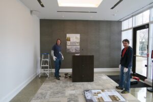
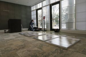
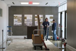
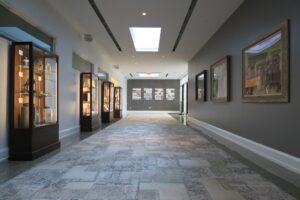
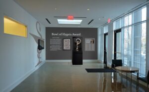
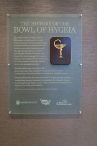
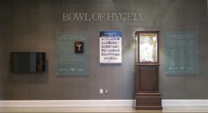
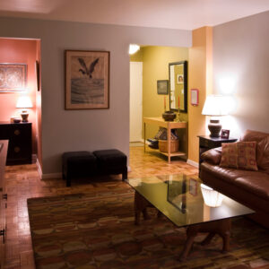
Work in progress. Putting together an exhibition requires mathematical precision and good attitude. We are always thankful for all the hard work and effort of many people involved in our projects. Thanks to them the final results are astounding! Color scheme, wall finishes, carpeting, window treatment, and exhibition display by Eisemann Design.
A post on framing wall art is coming, in the meantime…
A conference room dedicated to women
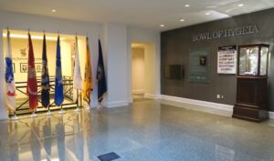
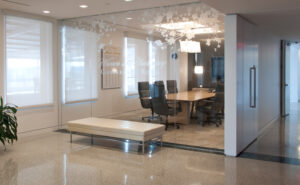
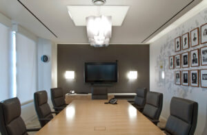
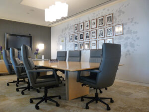
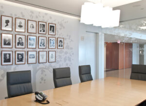
Finally, I have some photos of my latest commercial project to share with you! I had the pleasure to work with the American Pharmacists Association in Washington DC on the Women in Pharmacy Conference Room. It is a special place at the APhA’s beautiful headquarters in downtown DC dedicated to the women who significantly contributed to the profession of pharmacy in the USA.
Floral motive on the glass partition and the family tree is inspired by the cherry blossoms native to the Washington mall located just outside of the APhA headquarters by the Lincoln Memorial.
I tried to be sensitive to the contemporary design of the building and its green principles – I selected materials that are environmentally friendly and mostly made in America.
The Bay of Color
Art in the window display of the Susan Calloway Gallery in Georgetown always makes me hit my brakes!
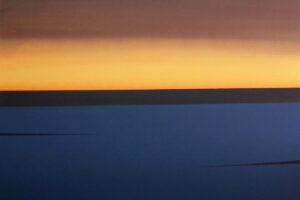
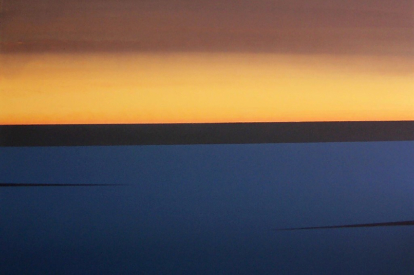
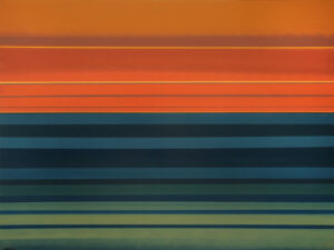
When driving down to M Street last night I saw an ocean or more precisely a bay of color: two stunning paintings by Stephen Day representing the colors of the Chesapeake Bay. It is so realistic yet abstract! – one would say about Day’s representations of color, mood and seasons of the Chesapeake area. And it is such a new and refreshing way of portraying the Bay. Interestingly… the show reminds me of the recent presentation of the Washington Color School at the Corcoran Gallery of Art – especially the paintings by Gene Davis. See my post below.
