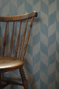
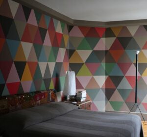
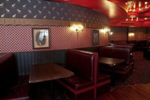
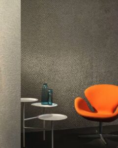
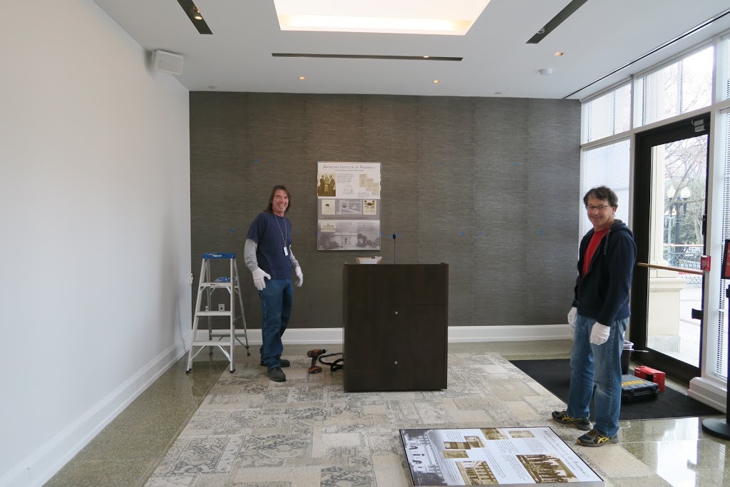
It takes a village to put an exhibition together

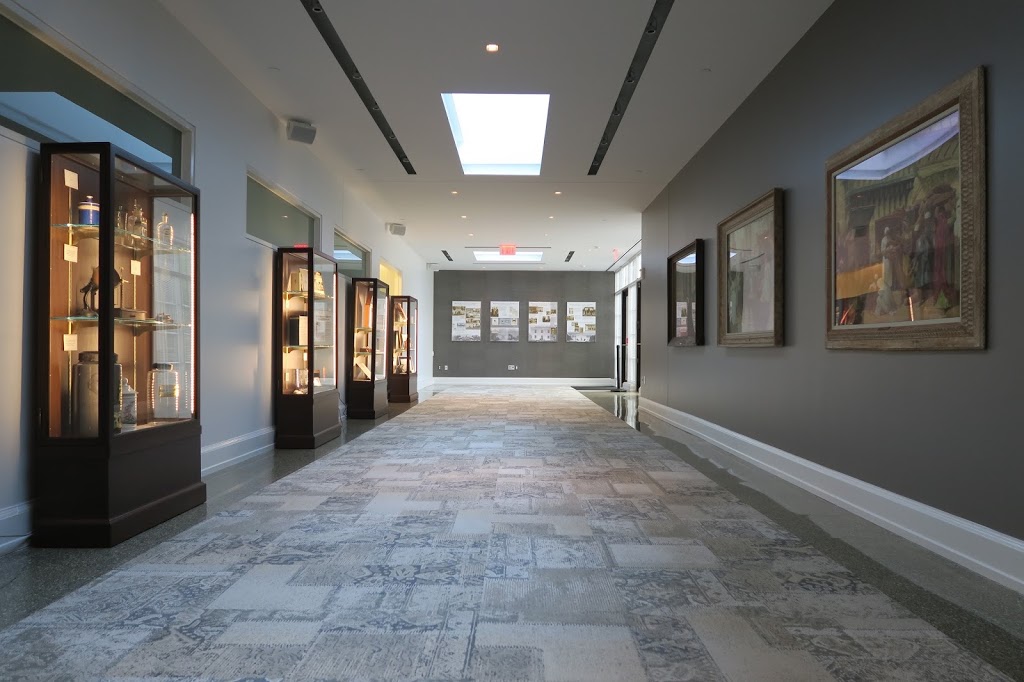
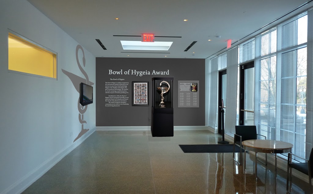
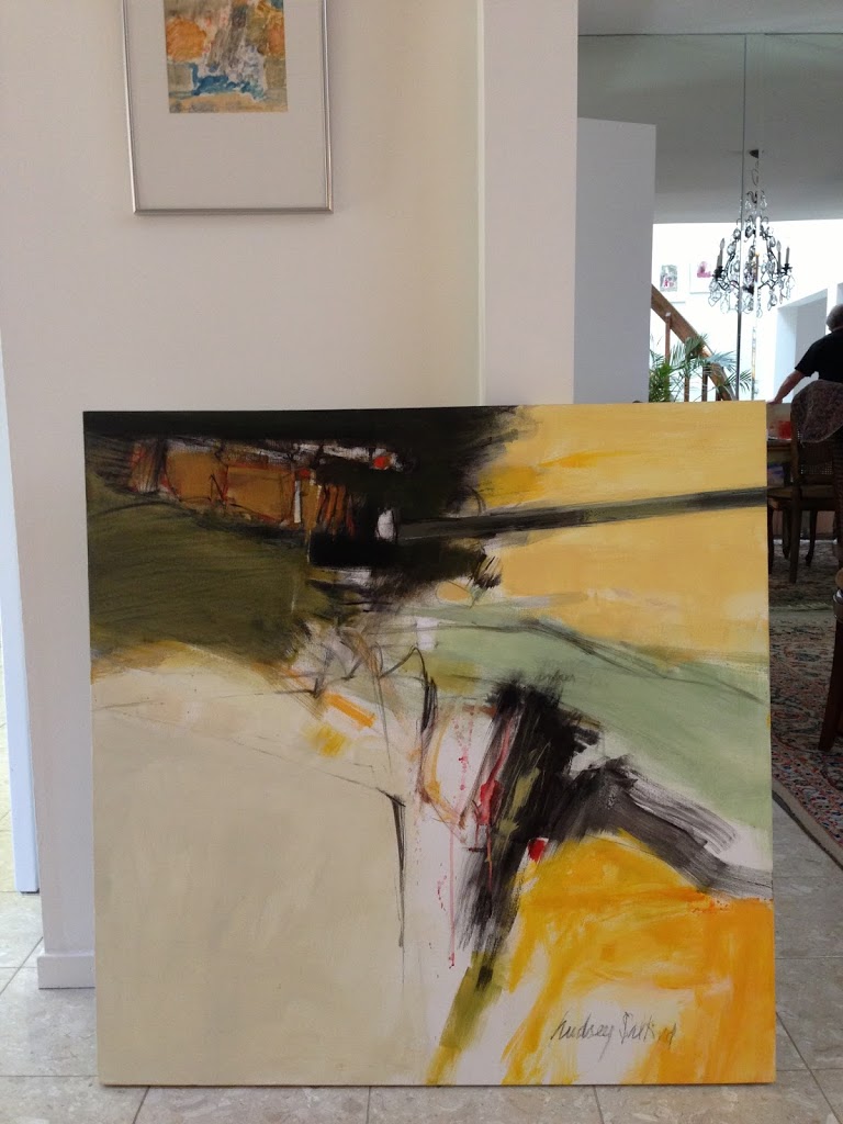
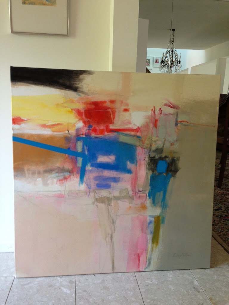
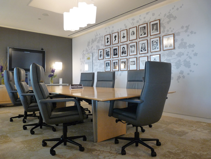
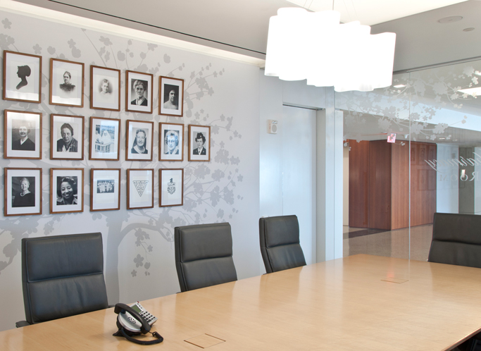
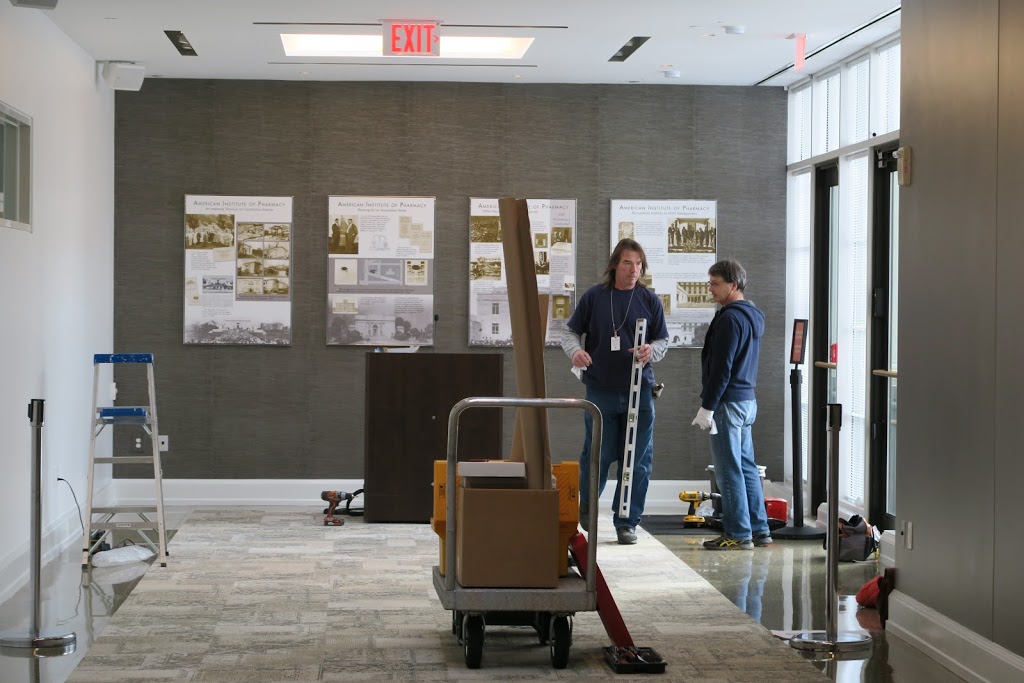
Work in progress. Putting together an exhibition requires mathematical precision and good attitude. We are always thankful for all the hard work and effort of many people involved in our projects. Thanks to them the final results are astounding! Color scheme, wall finishes, carpeting, window treatment, and exhibition display by Eisemann Design.

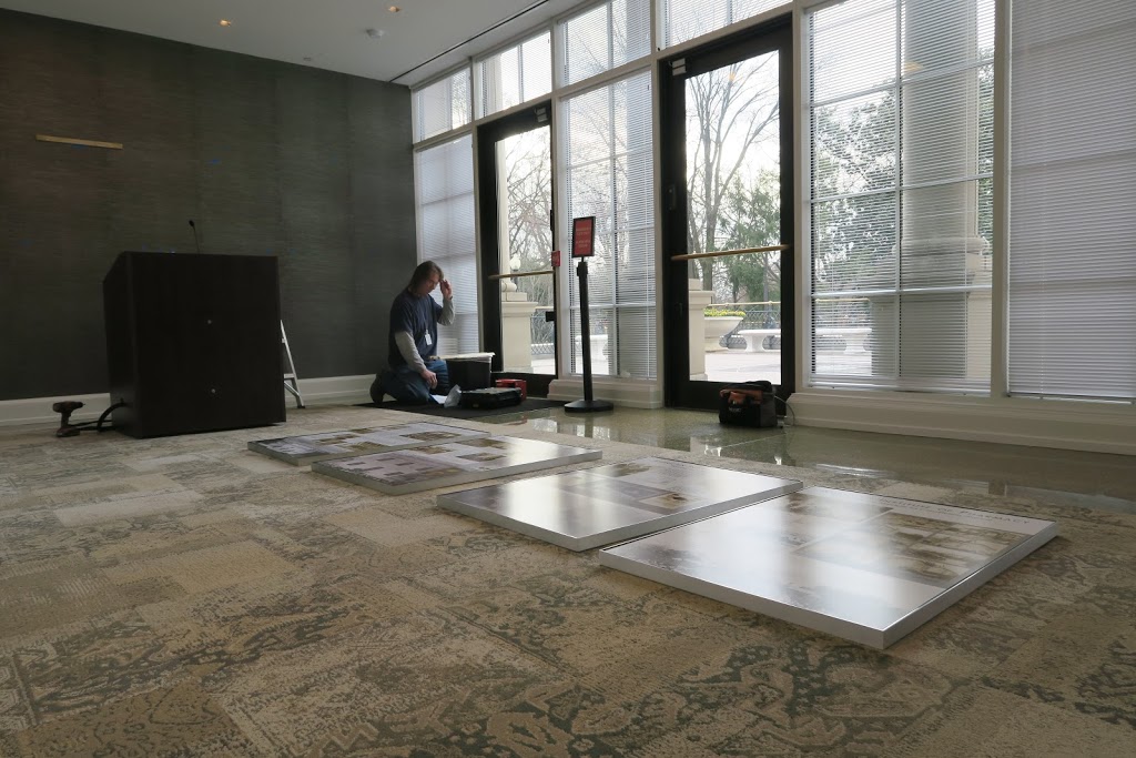
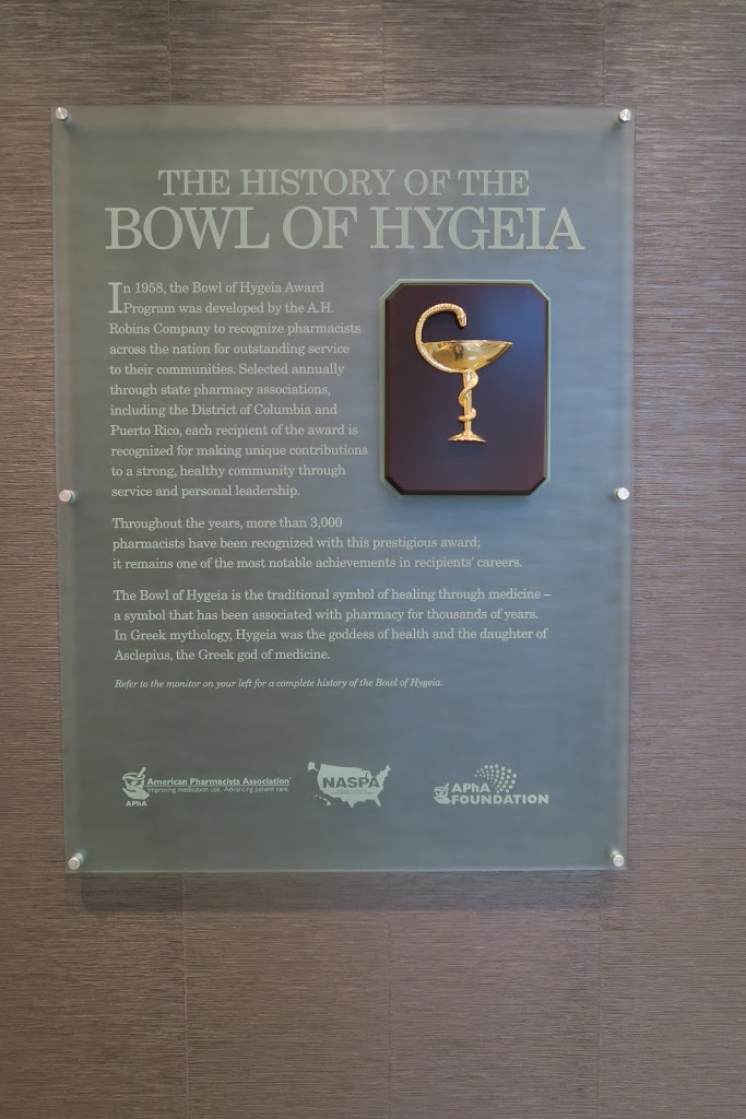
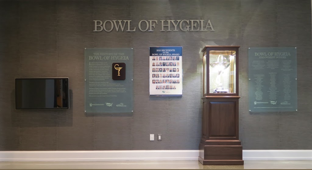
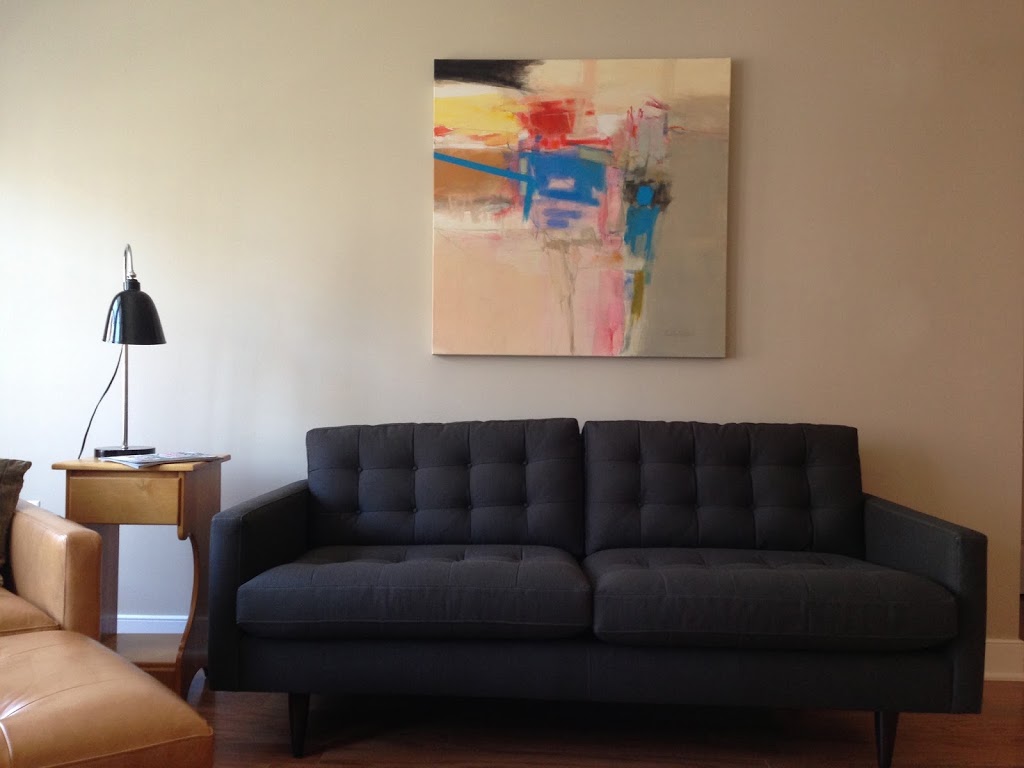
After hours of work, the final result is all worth that effort:

A conference room dedicated to women

Finally, I have some photos of my latest commercial project to share with you! I had the pleasure to work with the American Pharmacists Association in Washington DC on the Women in Pharmacy Conference Room. It is a special place at the APhA’s beautiful headquarters in downtown DC dedicated to the women who significantly contributed to the profession of pharmacy in the USA.

Floral motive on the glass partition and the family tree is inspired by the cherry blossoms native to the Washington mall located just outside of the APhA headquarters by the Lincoln Memorial.

I tried to be sensitive to the contemporary design of the building and its green principles – I selected materials that are environmentally friendly and mostly made in America.


We present our selection of five great tables on the market!

One of my recent projects took me to a few local stores to carefully inspect their table selection. I did my research and selected five “fearless” tables that met my five basic criteria:
 
1. To be equally beautiful and practical.

2. To be stable enough to support me when I want to stand on top of it to change a bulb in a light fixture above it.

3. To have a durable surface so that I am not afraid to destroy it by using warm plates and sharp objects on it.

4. To be universal enough to be used both in a dining room or a kitchen. 
5. To have an interesting design that it could stand on its own in an empty room and still be fearlessly beautiful.

 
Presenting five “fearless” tables:

1. Beautiful and sculptural Cross Extension Table designed by Matthew Hilton, sold by Design Within Reach. Made of a solid oak base and an oak veneer top. The Cross table can go with matching chairs in Scandinavian style or some plain slipcover chairs. $3,500. Available in Oak:
 
 
Or in Venge:
 
2. Beautiful in its simplicity Dakota Table from Crate and Barrel is reduced to a large sanded plank of oak wood based on four smaller planks serving as supports. The European oak has a sophisticated shade of gray achieved by “fuming” – a technique of changing the color of wood without staining. Dakota table can be paired with almost any kind of chairs. Starts from $1,399.

 
 3. Built from solid French oak the Mendocino Table from Wiliams and Sonoma is modeled after a carpenter’s workbench. The visible mortise-and-tenon joints reveal the honest origins of the table and create interesting accents.
 
Mendocino table comes in a warm honey-hued hand-rubbed beeswax finish. The table can complement both traditional and contemporary decors. Yours for $2,250.
 
 
4. Parsons Reclaimed Russian Oak Dining Table from Restoration Hardware is the ultimate rustic choice. It is handcrafted of solid white oak timbers reclaimed from old buildings in Russia. Free of any ornamentation or finish this simple and honest table can be used best in contemporary interiors filled with metal, glass and plastic finishes. From $2,495.
 
 
5. And finally a round option from Mitchell Gold & Bob Williams. The Townsend Table is made of stainless steel and tempered glass. As MG&BW best describe it can be a star without taking over a room. It is perfect for smaller rooms and for apartments, and surprisingly enough it can go both with contemporary and antique furniture pieces. Seats four for $1,370.
 

Nando’s flavorful decor

How often do we realize that a restaurant we go to for lunch actually has a nice decor?
Do we even see what surrounds our lunch table any more? I think that in today’s fast paced world we tend to just take an hour long break and rush to a lunch place to grab some quick food. We mostly end up having an ok lunch for almost exactly the same price – around $10 per person in the Washington DC area. If the price for a lunch is artificially maintained at the same level no matter the cuisine, why would anybody care to put some extra attention into decor to make a restaurant any different or nicer than the others? So, all the lunch places in the area look more or less the same, lacking personality.

I think it takes away so much from our dining experience. Pushing out local business and growing domination of chain restaurants is part of the reason. That’s why it is important to point out chain restaurants that actually stand out against the crowd and put some extra effort to create a nice ambiance for dining. Nando’s Peri Peri is one of those places.

 I have been to the Washington, DC and Silver Spring locations of this international chain. They carry a common African theme presented in contemporary manner yet the decor details are slightly different. The furniture layout is always unique to each place with booths and nice oversize tables that can accommodate larger groups. There are different clay pots with exotic wood limbs. Sculptural pendants create accents and set the mood. Colorful paintings on the walls are original!

I love how the unique flavors of this South African cuisine were translated into the color schemes. Warm shades of reds and oranges used in paint, chairs color or artwork represent a signature spice – Peri Peri (red pepper in Swahili). Bold wall finishes with reach texture (photo below) make me think of an African desert.  The food is very tasty, but an interesting and unique decor makes it easy to pass on many other restaurant options in the area and return to Nando’s.


Farmer’s Market Inspiration

My best design ideas are usually inspired by nature. Today I came back from my local farmer’s market in Silver Spring with delicious fruits and veggies… and also with some fresh paint color ideas.

The paint colors below come from the Infinite Beauty Collection by Mythic – a low VOC, non toxic paint.
 

Kitchen in Italian Sun. Accent wall in Raspberry Ice.

Living Room in Taupe Temptation. Accent wall/accents in Buttered Toast and Spanish Rose.
 
Bedroom walls in Prairie Path. Accessories and art with red.

Wallpaper, here it comes!

Let’s talk wallpaper, and I don’t mean old fashioned overwhelming dark wallpaper that covered entire interior walls of Victorian homes. I mean contemporary wallpaper with funky designs and interesting textures. We don’t want them to cover the whole room any more, we just want a small taste of it, simply to set the mood.

I love using wallpaper on small areas, on accent walls or on those architectural elements that stick out (walls that cover fireplace chimneys) or inside the nooks. Wallpaper draws attention to those bumps or hollows in the walls and give them new significance and character.

I like the wallpaper with repetitive patterns in particular. They cannot be produced by faux painting as the repetition requires absolute precision. The wallpaper shown below and hand made by an English based company (www.handmadewallpaper.co.uk) is inspired by graphic art and printmaking. 
 

The black pattern on white background looks sharp covering an accent wall while the other walls remain white. It could work both with sleek contemporary furniture and in more traditional homes filled with antiques.  The wallpaper by Dunford Wood below shows another version of an iconic chevron pattern. It works great in small areas like narrow hallways, staircases or powder rooms. Warm and faded color creates an interesting background both for antique and more contemporary furniture.

If your room is in a desperate need of color you may want to get a roll of two of this beautiful wallpaper hand made by the Paris based company Minakani (shown below). I would use it only as an accent on one wall or inside a nook. It can be used in residential and commercial settings adding warmth and interest to any area with no need for further accessorizing.


Commercial spaces are great to test some more funky wall coverings. This textured wallpaper by British company Beware-The-Moon features a repetitive golden Ostrich pattern on a navy blue background. It adds warmth and interest to a restaurant setting.

Another textured wallpaper by the same boutique company features a velvet skull pattern on the oil slick background.

Maya Romanoff also creates unique textures like this one shown bellow which is hand made of Nepalese lotka paper with flecks of mica. It works great on accent walls in hotels or apartment building lobbies.
 

Hand made wallpaper can also come in eco-friendly additions that are perfect for kids rooms. This non-toxic wallpaper by Paperboy is inspired by the ancient art of shadow puppetry and features screen printed animal shapes.


Privacy Settings
We use cookies to enhance your experience while using our website. If you are using our Services via a browser you can restrict, block or remove cookies through your web browser settings. We also use content and scripts from third parties that may use tracking technologies. You can selectively provide your consent below to allow such third party embeds. For complete information about the cookies we use, data we collect and how we process them, please check our Privacy Policy
Youtube
Consent to display content from Youtube
Vimeo
Consent to display content from Vimeo
Google Maps
Consent to display content from Google