It’s official – Spring has arrived!

I love the way Indian culture experiences color. Here a joyous Indian Hindu crowd in Borsana, India throws colorful powder (pigment) in the air in celebration of welcoming the Spring (photo by Kevin Frayer/AP) What fun!

During Lathmar Holi festival people pour water over themselves, paint their bodies and get in the colorful mud simply to express their happiness. Photo by Manan Vatsyayana/AFP/Getty Images.

Deep and saturated shades of purple, red, orange and yellow in traditional Indian clothing create floral-like patterns. This image reminds me of some French paintings from the end of the 19th century created in pointillist technique (squint your eyes). Here is another shot from the Lathmar Holi festival photo by Adnan Abidi for Reuters.


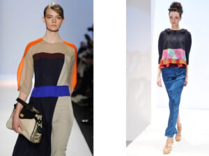
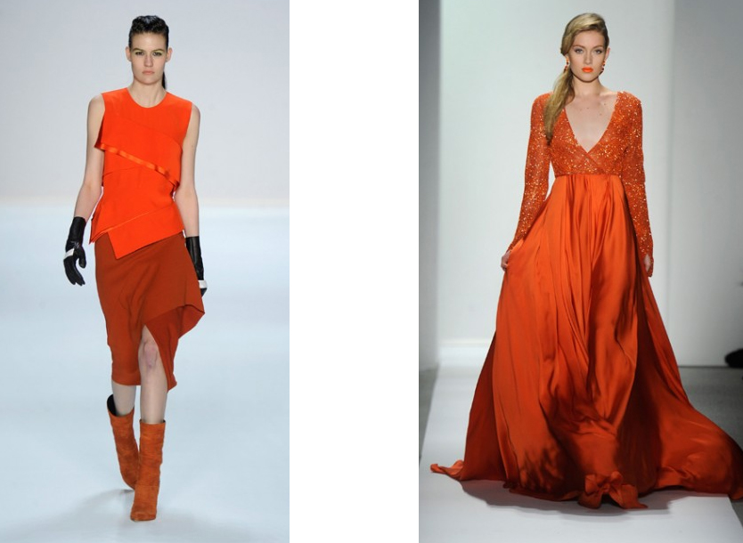
Tangerine Tango on the runway
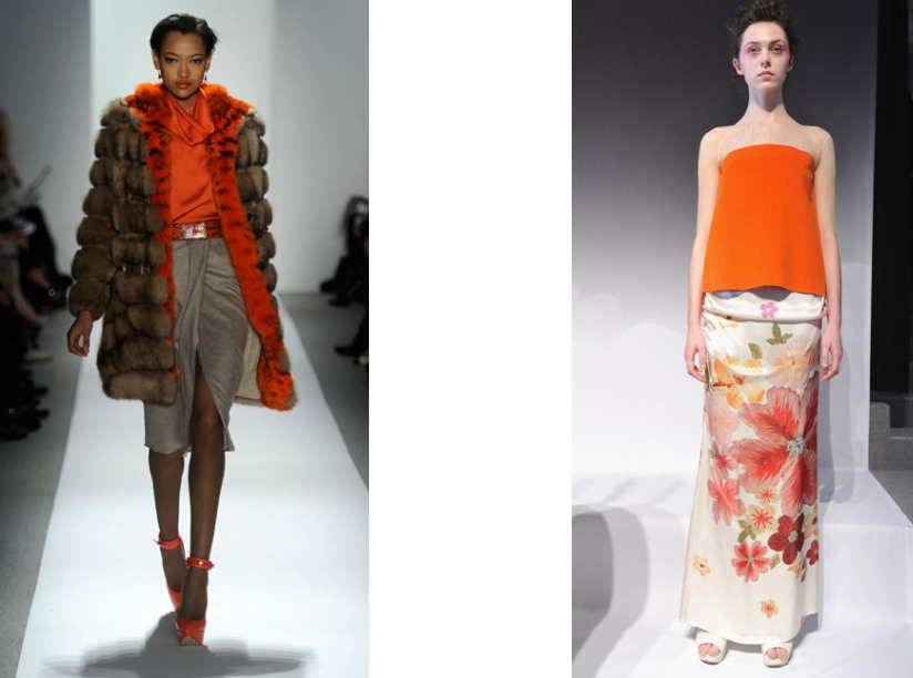
Ever since Pantoneâ„¢ announced Tangerine Tango to be their 2012 Color of the Year we can find this vibrant color used in many different areas of design. It has been a popular accent color in contemporary interiors for some time now. The latest New York Fashion Week also featured some beautiful shades of this universal color. Here are some of my favorite designs:
Asymmetric casual getup by Narcisco Rodriguez and long sleeve dress by Dennis Bosso.
More casual look by Dennis Bosso  and another beautiful dress by Concept Korea.
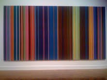
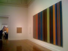
The color of tangerine goes very well with shades of gray and light beige both in fashion design and the interiors. As an accent color can be also successfully combined with deeper shades of blue as shown below in the designs by BCBG Max Azria and by Concept Korea:


Our selection of great sculptural Pendants

A sculptural pendant can give a great opportunity to make a big design statement. They work especially well in contemporary spaces with clean lines where they can stand out and shine like a star. Here is my selection of sculptural pendants that can be very effective in living rooms, foyers and over dining tables. Let me know which one tickles your fancy 🙂

My all time favorite Artochoke Lamp designed by Poul Henningsen is a classic icon of mid century modern Scandinavian design. Originally designed for a restaurant in Copenhagen called the Langelinie Pavilion (still in use today). It seems so elegant and timeless. Looks sharp in commercial spaces, hallways as well as modern homes. Diameter from 19″ to 33″ (large lamp). From $7,000

Another sculptural pendant called Logico is from Artemide. Looks great in both commercial spaces and over a dining table at home. Handblown glass with satin finish. Diameter from 18″. $1,650

Below is a beautiful pendant called Vertigo from Corbett Lighting. It gives warm and diffused light, and is perfect for foyers and living rooms. Diameter from 18″ to 30″.  From $650

Maskros pendant from IKEA reminds me of a dandelion, summer and fun. It is such a cool and charming lamp that can jazz up any space for only $90. Dia 32″.

 
I love this new design from Hubbardton Forge called Kirigami (3-light). It has such a simple and beautiful shape and it seems so effortlessly elegant. Diameter 34″. From $690. Comes in white shade and here is shown in amber:


Below is an “artichok lamp – inspired” Possini pendant for only $300. Diameter 19″

And last but not least Goccia pendant designed by Stevano Papi from SLAMP. Made of recycled plastic materials. It gives warm ambient light and casts interesting shadows on the walls. Great for smaller spaces, such as small foyer or bathroom. Diameter 12″. $350 


2011 Venice Biennale

                                                                 Main Building

                                           Selected items from the US Pavilion


Summer is officially over but let’s keep the mood going!

Here are some images from the highlight of my summer 2011

 Venice. The ever elegant blue and black color scheme.

Sunset lighting brings up the warm and rich colors of the local stucco.

 The fabulous Peggy Guggenheim Modern Art Collection by the Grand Canal.

 Enormous hand-blown contemporary vases from Murano.

 Traditional Murano-style chandelier with an abundance of ceiling frescos.

Art is everywhere during the Biennale time.

Going back home with unforgettable memories and tons of inspiration.


The Quest for the Best Chest

While looking for some “feminine” rustic chest options for one of my clients I came across a few nice pieces at the Highpoint furniture market last week. There is a reason why chests sometimes are qualified as accent pieces. Some of them have strong enough character to stand out on their own and create a bold accent in a room. But in today’s market that tries to please everybody it is hard to find a chest that would not have too many things going on at once. Here are some pieces that caught my eye for their clean and honest look:

A Messina chest from Noir could have been my favorite piece with its gentle curves and unusual zinc finish. I kind of liked its exaggerated width even though it made its drawers hard to open. As I said it would be my pick if the construction quality was not so poor. And here is another nice piece:

I was attracted to that plain and simple chest for the very same qualities. Seams like it could go with almost everything still maintaining its own unique style. I could not open its drawers though. It is too bad because I would not want to destroy its nice clean lines with any pulls. This chest on the other hand is screaming for some new pulls:

A set of plain and larger pulls or just some simple round metal or glass pulls would make that piece a winner. I love its weathered wood finish and gentle feminine curves.

Finally, I can’t stop thinking of the Restoration Hardware Directoire chest. There is something very graceful and timeless about that piece. It has such an honest look and perfect proportions. That’s my pick:


The Bay of Color

Art in the window display of the Susan Calloway Gallery in Georgetown always makes me hit my brakes!

When driving down to M Street last night I saw an ocean or more precisely a bay of color: two stunning paintings by Stephen Day representing the colors of the Chesapeake Bay. It is so realistic yet abstract! – one would say about Day’s representations of color, mood and seasons of the Chesapeake area. And it is such a new and refreshing way of portraying the Bay. Interestingly… the show reminds me of the recent presentation of the Washington Color School at the Corcoran Gallery of Art – especially the paintings by Gene Davis. See my post below.


Colors of Washington DC

For those who love color and the city of Washington there is a rare treat – a show at the Corcoran Gallery of Art featuring artists associated with the Washington Color School. Among them Gene Davis and Thomas Downing who were both based in Washington, DC.

Washington Post art critic Paul Richard who spoke last week at the Corcoran said he could see some pastel yet vibrant colors of the cherry blossom festival in the paintings of Gene Davis and others from the Washington Colors School. He said their art was so unique to the DC area and so different from the paintings of their NY contemporaries from the abstract expressionist movement.

Well, I just loved to stare at those large scale paintings at the Corcoran. Some of them take up almost the entire wall of the exhibition hall. I could see that the individual colors were really defined by their interaction with the others.


Privacy Settings
We use cookies to enhance your experience while using our website. If you are using our Services via a browser you can restrict, block or remove cookies through your web browser settings. We also use content and scripts from third parties that may use tracking technologies. You can selectively provide your consent below to allow such third party embeds. For complete information about the cookies we use, data we collect and how we process them, please check our Privacy Policy
Youtube
Consent to display content from Youtube
Vimeo
Consent to display content from Vimeo
Google Maps
Consent to display content from Google